Equity and Innovation Report
Chapter 3: First Quintile


Overview
The first 20 percent of Cambridge households in terms of income is the most racially and ethnically diverse. People in this quintile are more likely to be Black or older, long-term residents who live alone. They tend to be part of Cambridge’s service-sector workforce. The few children who remain in this group are very likely to be in single-parent households.
Neighborhoods with the greatest share of households in the first quintile


Sources: 2005–2009 and 2014–2018 American Community Survey 5-Year Estimates.
Chart 3.1: Distribution of Black and White Populations by Quintile, 2018
The first quintile is the heart of Black Cambridge.
People and Households (2009-2018)
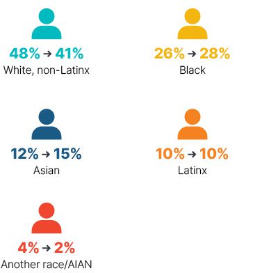
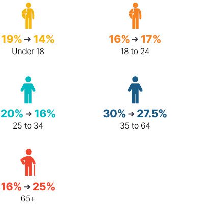
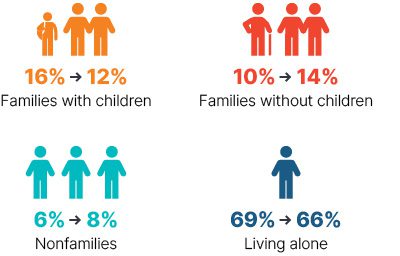
This is the only income group in the city where people of color are in the majority, with the slice of the pie growing from 52 percent to 59 percent over the decade. More than a quarter of this population is Black, and a full 40 percent of the city’s Black population is in this quintile. This income tier has gotten older over the past decade and includes fewer children, with 25 percent of the people in this quintile 65 or older, up significantly from 16 percent in 2009. The majority of households are single persons living alone. Children are disappearing faster here than in any other quintile, but of the remaining families with children, nearly 70 percent are headed by a single caregiver.
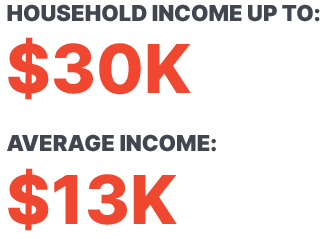
Over the past decade, the average household income for the first quintile increased by just 6 percent when adjusted for inflation. This is the lowest growth of any quintile.
Race/Ethnicity
Increasing population of Black and Asian residents
Age
Fewer children, more seniors
Household Type
There are fewer families with children
Sources: 2005–2009 and 2014–2018 American Community Survey 5-Year Estimates.
Housing and Community (2009-2018)
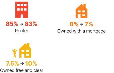
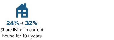
Most people in the first 20 percent are renters, although there has been a slight increase in those who own their homes free and clear. Given the high value of housing in Cambridge, this could indicate a low-income population with a relatively high net worth. Although the majority of these households pay half of their income or more for housing, the number spending more than 30 percent of their income on rent has fallen from 67 percent to 56.4 percent of renters and from nearly 80 percent to 67.7 percent of owners. Renters in this quintile are moving less often than they did a decade ago, and more than a third of them (up from a quarter) have lived in their present home for at least 10 years.
Tenure
More homes owned with no mortgage
Extreme Cost Burden (>50%)
Fewer extremely cost-burdened households

Stability
More long-term residents
Sources: 2005–2009 and 2014–2018 American Community Survey 5-Year Estimates.
Education and Jobs (2009-2018)
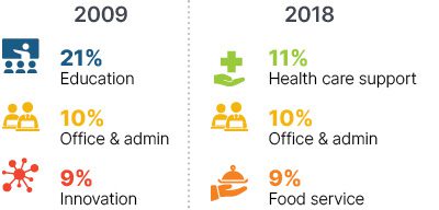
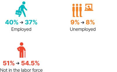
The past decade has seen an increase in less-educated adults: 18 percent in this quintile do not have a high school diploma, up from 14 percent. Moreover, fully half of working-age adults (25 to 64) without a post-secondary degree in Cambridge live in this quintile, up from 35 percent. In 2009, the largest share of working-aged adults in this quintile worked in education; now the dominant occupations are health care support and food service. Adults have the highest unemployment and the lowest labor-force participation rates. A full 54.5 percent are out of the labor force altogether.
Educational Attainment
More than half of adults lack a bachelor’s degree

Top Occupations
Core of frontline and essential service workers
Labor Force Participation
Fewer adults in the labor force
Sources: 2005–2009 and 2014–2018 American Community Survey 5-Year Estimates.
We have adjusted the standard naming conventions established by the U.S. Census Bureau in the following ways: “Hispanic/Latino” ethnicity is referred to as “Latinx”; “Black” refers to “Black/African American”; “Asian” includes “Native Hawaiian/Pacific Islander”; “Multiracial” refers to “Two or More”; and “Another race/AIAN” includes “Some Other” and American Indian/Alaska Native.” For more about our terminology on race and ethnicity »
