Equity and Innovation Report
Chapter 3: Second Quintile


Overview
The second 20 percent of households experienced the least change over the past decade in their overall demographic and housing profile, though this quintile remains the most varied in terms of its people and households. It includes single adults living alone, households without children, and lower-skilled workers who are becoming more credentialed by working on further degrees or certificates. Households in this quintile are highly mobile and more likely to be recent immigrants.
Neighborhoods with the greatest share of households in the second quintile


Sources: 2005–2009 and 2014–2018 American Community Survey 5-Year Estimates.
Chart 3.2: Share of Population Recently Moved from Another Country, 2018
The second quintile has the largest share of new immigrants.
People and Households (2009-2018)
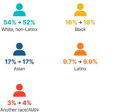
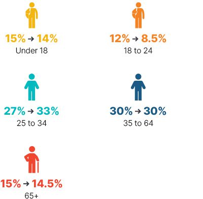
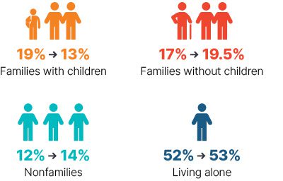
Though the second quintile remains majority white, close to half are now people of color. The largest generational shift in this quintile came with a slight increase in millennials aged 25 to 34; the group grew from 27 percent to 33 percent of the population. While 53 percent of households in the second quintile continue to be headed by a single person living alone, families with children declined from 18.6 percent to 13 percent of households over the past decade. Families with children in this quintile are more likely than they were a decade ago to be two-parent households: 62.3 percent of these families are headed by a married couple, up from 56.4 percent in 2009.
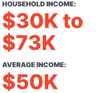
Households in the second quintile have seen the second-largest relative gains, with their average income up 23.5 percent and the top earners’ incomes up 27 percent over the decade, when adjusted for inflation.
Race/Ethnicity
Least demographic change
Age
Fewer student-aged residents
Household Type
Fewer families with children
Sources: 2005–2009 and 2014–2018 American Community Survey 5-Year Estimates.
Housing and Community (2009-2018)
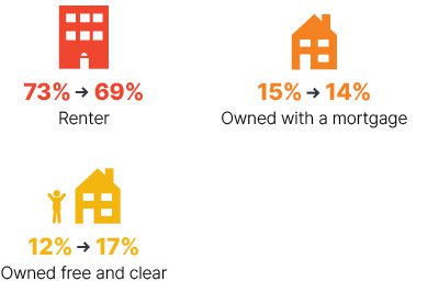
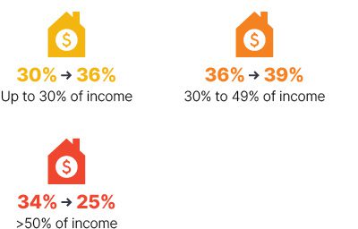
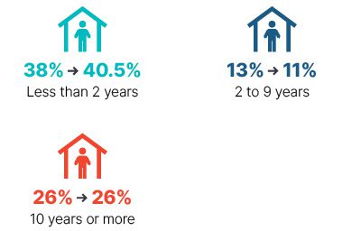
Households in this quintile have made income gains, and the number of households that own their homes outright has increased, but two-thirds of owners spend at least 30 percent of their income on housing. Income gains largely benefited homeowners rather than renters, as the share of cost-burdened owners fell from 61 to 45 percent. More than 40 percent of this quintile have lived in their current home less than two years. Among those who have moved in the past year, 35 percent moved from another state and a quarter from another country.
Tenure
More homes owned without a mortgage
Housing Costs as a Share of Income
Declining cost burden
Lived in Current Home for:
More recent movers
Sources: 2005–2009 and 2014–2018 American Community Survey 5-Year Estimates.
Education and Jobs (2009-2018)
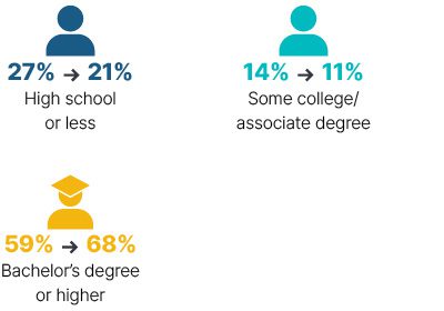
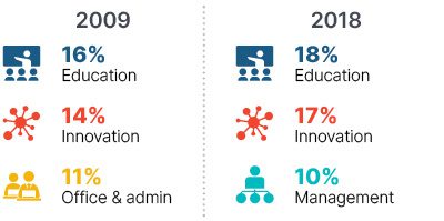
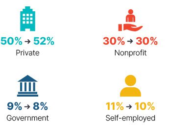
The share of adults in this quintile with a bachelor’s degree or higher increased from 59 percent to 68 percent — nearly all attributable to more adults with a master’s or higher degree. This quintile has the highest share of those employed in the nonprofit sector, with 18 percent in education, 17 percent in the innovation cluster, and 10 percent in management.
Educational Attainment
Large increase in adults with at least a bachelor’s degree
Top Occupations
Only quintile with top employment in education
Employment Sector
Quintile with the largest share of workers in the nonprofit sector
Sources: 2005–2009 and 2014–2018 American Community Survey 5-Year Estimates.
We have adjusted the standard naming conventions established by the U.S. Census Bureau in the following ways: “Hispanic/Latino” ethnicity is referred to as “Latinx”; “Black” refers to “Black/African American”; “Asian” includes “Native Hawaiian/Pacific Islander”; “Multiracial” refers to “Two or More”; and “Another race/AIAN” includes “Some Other” and American Indian/Alaska Native.” For more about our terminology on race and ethnicity »
