![]()
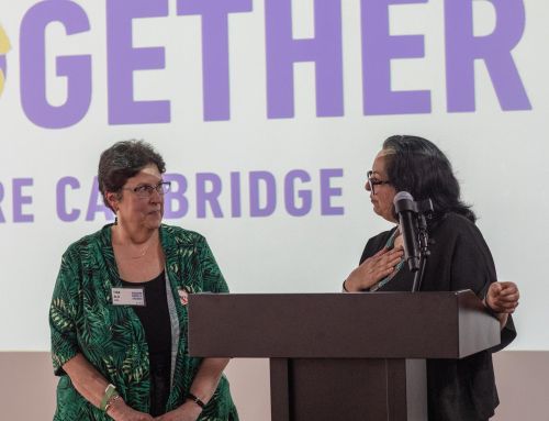
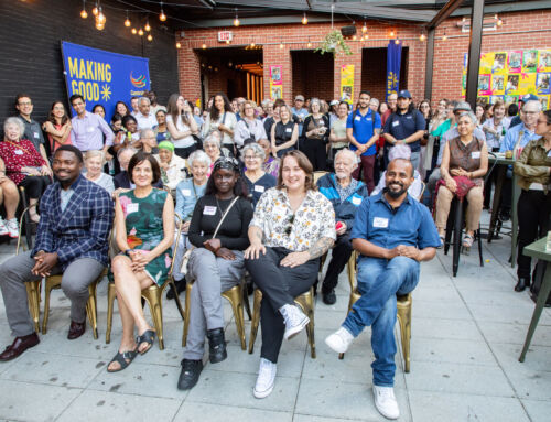
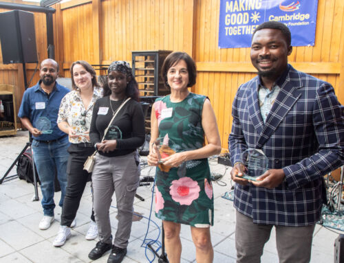
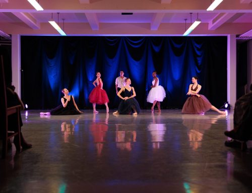
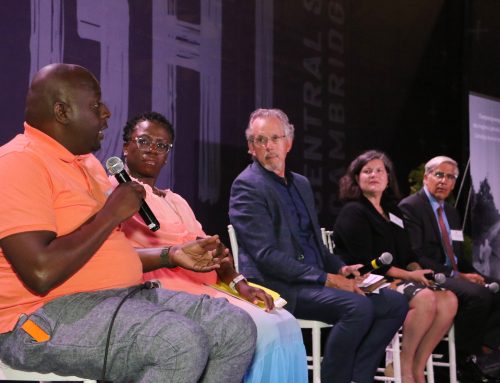
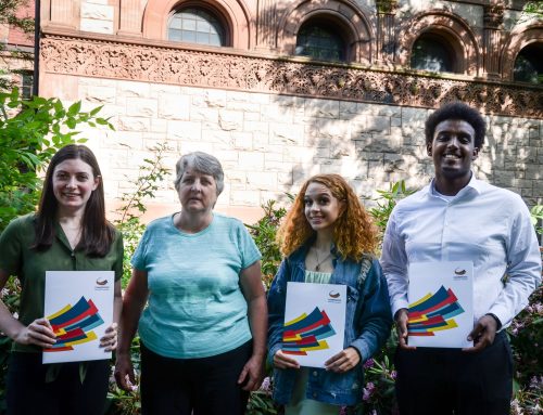
As the Cambridge Community Foundation prepares to begin its second century, it has reimagined its offices at 99 Bishop Allen Drive as a convening space for local nonprofit organizations, grown its staff to meet the challenges of life in the 21st century – and created a new logo to encapsulate its identity.
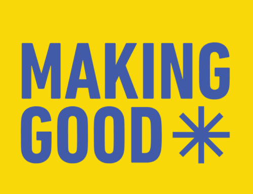
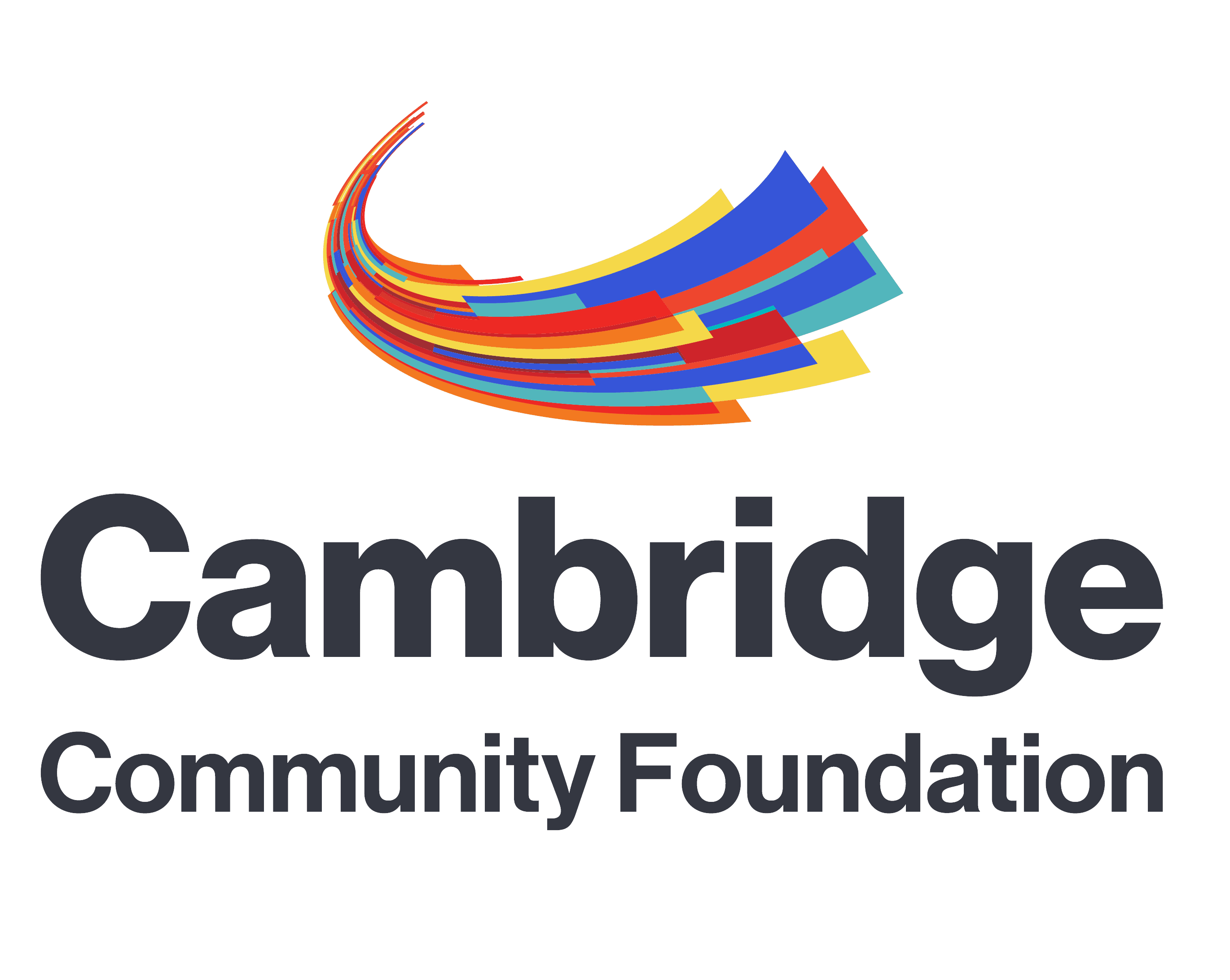
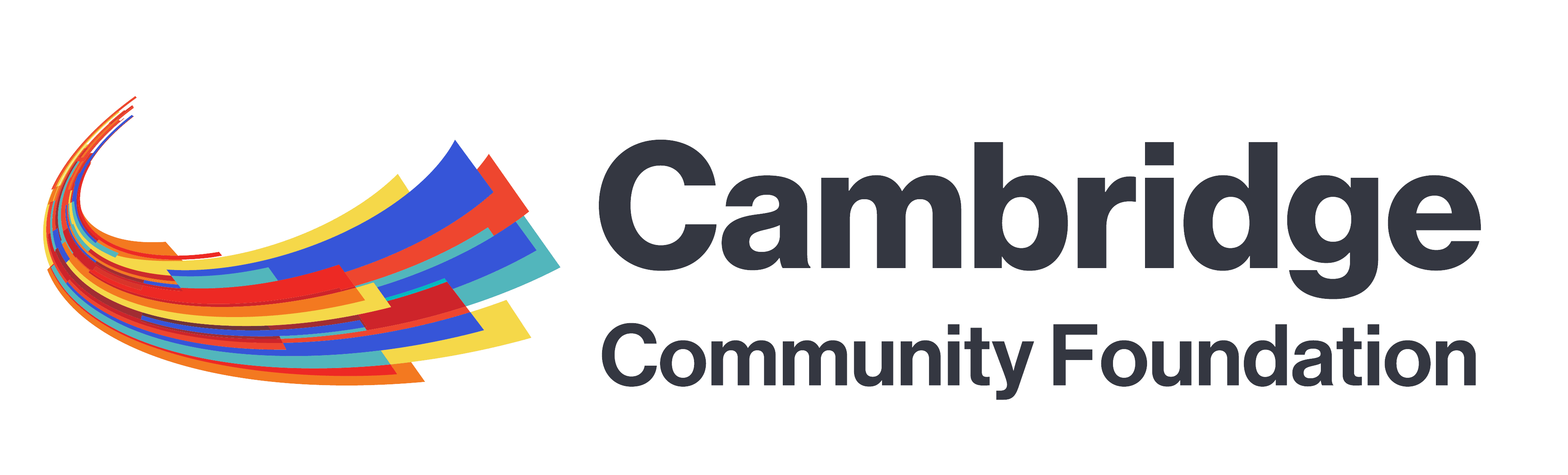
“We wanted a new emblem to capture key elements of our vision – a vibrant, diverse and inclusive city with a culture of giving and opportunity for all,” said Richard Harriman, board chairman of the Foundation. “We thought about the variety, complexity and sheer intensity of Cambridge and reached for those qualities.”
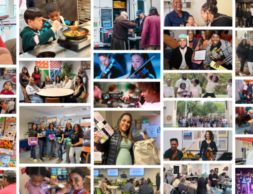
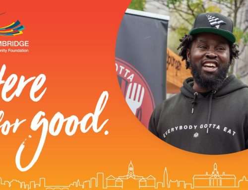
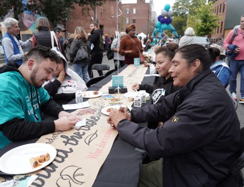
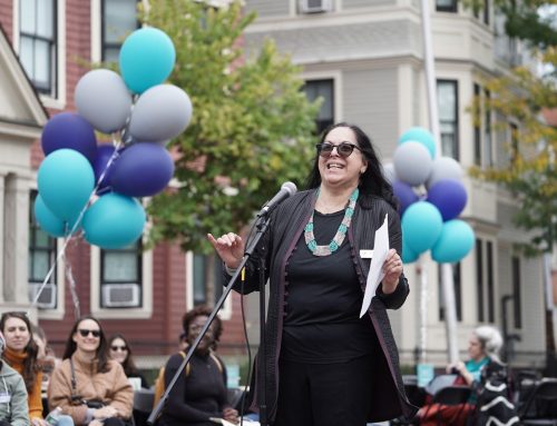
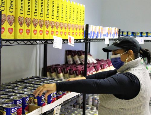
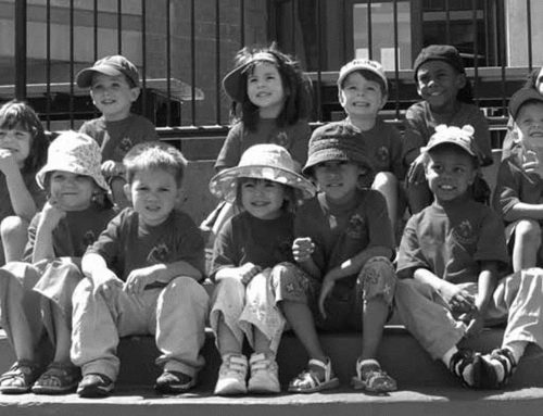
The Foundation was established in 1916, making it one of the oldest community foundations in the country. The only foundation with the whole city of Cambridge in its purview, it is a key supporter of nonprofit organizations, distributing $1.2 million in grants in 2015 to meet local needs and support the aspirations of Cambridge residents. The Foundation provides advocacy and civic engagement support to deal with urgent local challenges and partners with donors to provide a permanent source of charitable funds for the community.
“Logos are a challenge, but this was fun to imagine,” said Geeta Pradhan, Foundation president and CEO “We described the qualities we wanted to express – dynamism and diversity to begin with. It had to speak to every part of this city. And what we came up with was then beautifully translated into the element shown here by our designer, Carol Maglitta, principal at One Visual Mind.”
The new logo incorporates colors of the old logo, which has been in use for several decades, but bundles with them new colors – red, orange and yellow. The shape suggested an abstract “C” to many who saw the design as it came into being.
“We describe our mission using words like ‘Collaborator,’ ‘Convener for the Community,’ ‘Catalyst for change,’ and we were created to serve Cambridge,” said Pradhan. “So the letter C clearly resonates with us.”
Many also see the logo as many elements coming together to form one or, conversely, one element that opens to reveal all its parts.
For information, contact David Trueblood, [email protected], 617-576-9966